Display Nature: Silvanum
Terence Gower
“People who claim to see nature without having a concept of art see it only superficially, never in an ideal way, in its infinite splendor.”
– Thomas Bernhard
My investigation of nature and display started in the mid-1990s and led to a number of works and shows in that period. My interest is based on my earliest experiences growing up the Western Canadian landscape. I had great access to the mountains and lakes of Canada growing up. The love of nature I developed as a child—equal parts love and fear—had no aesthetic foundation. I was confused when visiting English relatives expounded on the beauty of our landscape. It was only later, through the study of art, that I developed an appreciation for visual beauty in nature, and at the same time developed a detachment from nature though this same visual understanding. My Display Nature project of the 1990s focused on art, photography, and nature, and this new project looks more closely at architecture’s role in “constructing” the view, channeling our appreciation of nature, and at the same time separating us from it. The site of this exhibition, the former forestry museum Silvanum, is the perfect context in which to experiment with these ideas, both through its architecture and through its original function as an institution dedicated to the scrutiny and display of nature. I am using an example from architectural history, Mies van der Rohe’s collages from the late 1930s, as a departure point for my investigation.
The Silvanum building was designed by Danish architect Erik Herløw in collaboration with Gävle city architect Sven Wranér, and completed in 1961. In keeping with the form-follows-function dictum of the era, the museum exhibits were determined first and the building built around them. The steel and concrete structure of the building was criticized in the press as an unlikely choice for a building designed to showcase the wood trades. But this kind of construction was the best way to achieve the freedom of movement desired by the exhibition designers. Wood was incorporated into the building in the form of shingle cladding, and treated log sections used as paving in the forecourt.
The steel structure of the Silvanum, when seen in plan, belies the open-plan building system developed by the German architect Ludwig Mies van der Rohe in the early twentieth century. In Mies’ system—now the dominant building method around the world—buildings were framed out in steel and clad on the outside in brick, concrete, wood, or glass. Interiors could be configured in any way, planned around a regular grid of columns. This is the system Herløw used when he designed the Silvanum building in the late 1950s.
Due to his fleeing Germany to the US in 1938, Mies designed a number of projects in this period that were never realized. These projects are known to us through the architect’s photograph-and-paper collages. Mies composed these collages to show how his buildings would relate to their surroundings, and to indicate the internal arrangement of partitions, windows, and even artworks. The best-known of these collages belong to a series he prepared for Helen and Stanley Resor for a country house in rural Wyoming.
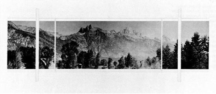
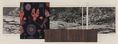
In the Resor House collages, the interior structural elements of the house—columns, window frames, floor tiles—are rendered in pencil on paper, and come off as near-invisible when seen against the dramatic view of the Grand Teton range. In other collages in the series (below), the cut-out photograph is the furthermost plane in a composition of overlaid rectangles. This objectification of the view (reduced to an element in a formal composition) is akin to the separation from nature we experience as we look out at a natural landscape through a window.
This mechanism is at play in all visual depictions of natural landscapes: in painting; in photography; in this kind of architectural rendering; and in architecture itself.
The Silvanum housed a number of exhibits that represented nature, isolating certain aspects of tree development and putting them under a microscope of sorts. The exhibition designers Gunnar Aagaard Andersen and Arne Malm used samples, models, and photography to bring nature into the museum (a Silvanum brochure points out that the museum’s photographers took as many as 200 photographs to get the right detail of a tree branch, a pine cone, or a bark pattern.) The exhibits were analytical and concentrated, isolating their subjects from the outside world and bringing them into the museum. They were separated from their natural contexts in a similar way a landscape is detached from an observer as they gaze at it through the windows of a building.
The Silvanum building was designed in the form of a square slab, supported by radiating fieldstone walls and pilotis. It was laid out in a Miesian open plan, except for a courtyard and auditorium that occupied the box’s centre and turned the remaining space into four oblong interconnected galleries. The westernmost gallery now houses the Gävle Konstcentrum. A long wall of windows running along half of the north wall of the museum turned the west gallery into a view corridor looking out over the surrounding landscape. The landscape seems to have been carefully composed for the view from this window, with the picturesque Gävle River (a former lumber transportation route) in the background.
Seen from inside the museum, the resulting composition, with steel columns, wall of glass and natural view beyond is reminiscent of the tableau presented by Mies van der Rohe in his Resor House collages. But the effect was heightened here, due to the theme of the museum, which was in fact the observation of nature and the forest. In both cases we have modern architecture, with its open interiors and glass walls as the ideal apparatus of observation. These buildings are like optical devices as if we as viewers are standing inside a camera looking out through the lens. Standing in the former Silvanum, or gazing at the collage of the Resor House, we see nature laid out before us, but separated from us by the glass wall, as if put on display like an object in a vitrine.
Installation
The installation is made up of three elements: Two wooden panels arranged in front of the gallery’s windows; two 60 x 90 cm framed woodblock prints hung in the second gallery; and a document display table in the entry gallery around the corner. All elements of the installation are made of wood, an homage of sorts to the Silvanum.
1. The main installation, based on the print-collage “studies” shown on the second gallery wall, is based on a frontal view as the viewer enters the gallery. There is a sense of depth and layering to this tableau, but the compositional elements are flat rectangles. All elements are clearly crafted from wood, stained in different colours, but with visible grain. As the viewer approaches and moves through the group, the composition elements are revealed to be static props like the “flats” of a theatre set, while the view through the window remains dynamic. These props and flats could be samples or exhibits from a display of wood products.
2. The prints are based on Mies’ Resor House compositions, but juxtaposed with the view through the windows of the Gävle Konstcentrum. The photograph, with hand-drawn pencil details, is accompanied by a woodblock print positioned on a hand-drawn graphite rectangle on the threshold between a spatial study and pure abstraction.
3. The documentation table features a number of brochures and photographs from the city archives on the Silvanum. A wall text adjacent to the table focuses on the function and use of the architecture of the building and strategies of display.

