Terence Gower
Excerpted from Display Architecture, Navado Press, Berlin/Trieste, 2008
One of my earlier experiments as an artist had to do with ways of displaying objects in vitrines. Merchandise display was the perfect model for what I was learning about art. It had interesting things to say about both function and beauty. When an object is put on display, its original use is altered. The object ceases to fulfill its assigned function and temporarily becomes a model for itself and all others like it. An umbrella incorporated into a merchandise display ceases to be an object to protect us from the rain and becomes a model for the general class of objects called umbrellas. In other words, in a display, the object temporarily loses its use-value and becomes a model of itself.
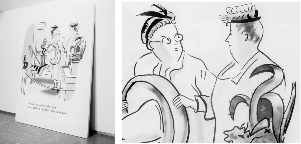
Display artists make their displays beautiful in order to sell merchandise; it is the icing on the cake. Commodities are displayed in as attractive a manner as possible to enhance their allure to prospective buyers. I have identified a number of aesthetic schools of display ranging from formal, symmetrical arrangements, to arrangements made to look as if they were casually placed, to postmodern “deconstructive” displays with exposed strings and visible seams in the backdrop. I’ve had the opportunity to analyze display while working in the display department of an uptown New York store, famous for the presentation of its merchandise. My work Sombrero is homage to the “casual school” of display: The piece consists of a cartoon painted on a panel that leans against the wall as if it has been casually put there. The cartoon depicts a lady in the midst of setting up a craft-show display saying to another, “I’d like to achieve the effect of a sombrero carelessly thrown down.” This scenario perfectly captures the intentionality of casual display, the deliberate creation of an artificial randomness, which relies on the viewer’s complicity for its success. It is a dilemma every artist faces when they arrange an art installation.
Sombrero, 2002. Enamel on wood panel. 244 x 183 x 5 cm. Photographs: Amanda Holmes
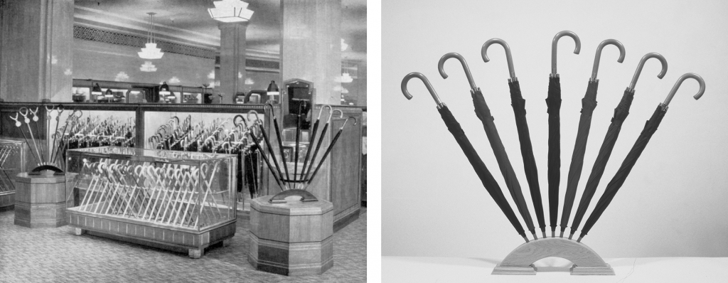
In the video work The Architecture of Shops a narrator gives the viewer an introductory course on shop design and product display. The video is projected on a freestanding screen in front of six chairs on which viewers are invited to sit. The video shows six black and white images of London shop interiors from the 1920s accompanied by a voice-over “lecture”. The narrator (all text and images were taken from A. Trystan Edwards’ book The Architecture of Shops. London: Chapman & Hall, 1931) spends much time analyzing an image of a Harrods umbrella display, dwelling on the display’s strange detachment from the real world of utility: “Here the objects on display look like they can’t be touched, let alone purchased.” The fan of umbrellas in the illustration, below left, is deemed particularly problematic. A fine example of symmetrical display, I had it painstakingly recreated and brought into the gallery ready for further study.
Left: The Architecture of Shops, 2002 – 2006. Video installation. 4:00 minutes, looped. Video still showing Harrod’s umbrella display. Photographer unknown.
Right: Display VII, 2003. Oak, umbrellas. 90 x 105 x 22 cm. Photograph by the artist
Whether symmetrical, casual, or deconstructionist, the aesthetic mechanism at work in a product display became my model for the role of beauty in the visual arts: it helps sell the product. This reductive view lined up with my interests in the anti-aesthetic of conceptual art and with my early interest in the anti-beaux-arts, anti-style revolution in architectural Functionalism.

